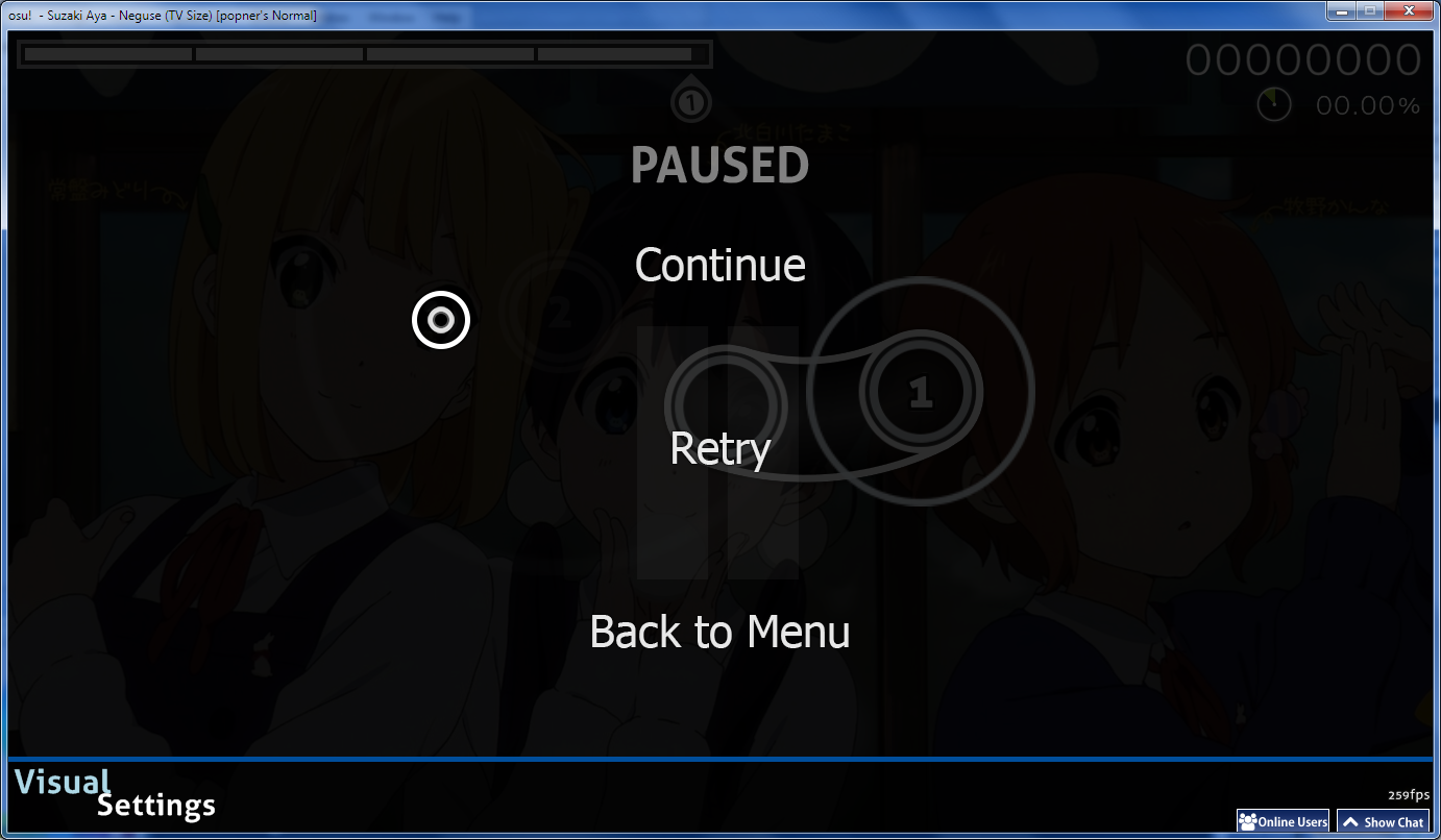
I don't usually post on the forums, however the skin caught my eye. It is really well done. Just played a map, and it is really easy to play with. Took me a few seconds to get use to since it was a bit more busy than skins I use. The design of each element matched really well. The only thing I didn't like was the pause screen. The pause in the background was too much of a distraction for me and didn't seem to fit. Since you said that standard is pretty much complete, I would suggest an optional hitcircle with a transparent middle like this. Also suggest a background for ranking graph.
forum
Aesthetic HD Skin [osu! | mania] - Version 1.3.1 v3y66
posted
Total Posts
364

Thanks to everyone for the nice words and !
The first update is here. It may be a small one, but there's some new hitcircles to test, let me know which one you like best!
Some of the issues you addressed aren't fixed yet, which I will hopefully take care of soon.
Link: Aesthetic_1.0.osk
File size: 16.44 MB

I tested your hitcircle idea for a while and I ended up liking it a lot. I included it along with a completely transparent hitcircle in this update, so it should appeal to more players with different preferences. I also put finding a possible replacement for the pause screen on my to do list. Can you elaborate on how exactly it feels distracting or unfitting? Thanks a lot for the suggestions!
The first update is here. It may be a small one, but there's some new hitcircles to test, let me know which one you like best!
Some of the issues you addressed aren't fixed yet, which I will hopefully take care of soon.
File size: 16.44 MB
Changelog
Version 1.0
- Added icon for Cinema mod
- Added two alternative transparent hitcircles
- Added ranking graph (An amazing rectangle!)
- Adjusted transparency of reverse arrow
- Centered pause and fail screen options
Thanks! That means a lot. Seeing that you created a skin in much the same spirit and how well it was received was a good motivation to finish this one.Uruoki wrote: o5b5i
I don't usually post on the forums, however the skin caught my eye. It is really well done. Just played a map, and it is really easy to play with. Took me a few seconds to get use to since it was a bit more busy than skins I use. The design of each element matched really well. The only thing I didn't like was the pause screen. The pause in the background was too much of a distraction for me and didn't seem to fit. Since you said that standard is pretty much complete, I would suggest an optional hitcircle with a transparent middle like this. Also suggest a background for ranking graph.
I tested your hitcircle idea for a while and I ended up liking it a lot. I included it along with a completely transparent hitcircle in this update, so it should appeal to more players with different preferences. I also put finding a possible replacement for the pause screen on my to do list. Can you elaborate on how exactly it feels distracting or unfitting? Thanks a lot for the suggestions!
You might be right - I put this on my list too, so I'll have a look the hitsounds and see which need a bit of a boost and/or improvement. Thank you again!Pannari wrote: 242i2s
This skin is /extremely/ beautiful. The only thing is that the hitsounds could be a bit louder, and this would be perfect.
Might be my favourite part, too.Noobsicle wrote: 4d3b18
very nice skin, i love the lifebar
If you are playing and you pause in the middle of the song, you may have 4 things overlap.Redon wrote: 6g5w6i
Can you elaborate on how exactly it feels distracting or unfitting? Thanks a lot for the suggestions!
Hitcircles, the "PAUSE" in the background, the "| |" also in the background and the "Continue", "Retry" and "Back to Menu" options.
To me, four things overlapping is too busy for me.
Hope that clear things up.
Also, if you did make the transparent hitcircles, make sure you made the reverse arrow to match it.
Keep up the good job.
Quest
Just to let you know, the OSK file packs a folder inside a folder. So you have to drag the folder out and replace it. http://a.pomf.se/fixwxu.png
Thank you for the compliments and ! Here's another little update. It includes reworked hitsounds, which I hope are more audible and provide better while playing.
There is a new large cursor alternative, as requested by Piku201. I tried to make it feel a bit like the default cursor, I hope it worked out. If you have any suggestions, let me know.
As a third thing, I added an animated followpoint based on Uruoki's concept in Luminance. It's essentially the same line followpoint, but animated to fade out quickly, which gives it a nice visual effect of moving from circle to circle, and reduces the amount of lines that clutter the playfield. Personally, I found that followpoint amazing from the first moment - it helped me with jumps, and I now find the lines a lot less distracting than they were before.
I hope that everything works fine, if you find any issues or have some suggestions, let me know.
Link: Aesthetic.osk (v1.1, 10. March 2014)
(Zip archive: Aesthetic_1.1.zip)
File size: 16.93 MB
Status: Osu! standard complete
If you've ed the skin already and want to update, make sure you delete the old version first.
If what you meant was that they don't resemble a drum-like soundset like the osu default, I hope you understand why that's not the case. I suppose I could consider adding an alternative set of sound samples that's less clicky and resembles the original sounds more.
The color idea is interesting! However, I wasn't too happy with the result when I gave it a try ingame - perhaps it's because a baby blue color is a bigger step from the current range of colors, which are just 50° apart each? I honestly thought that going the other way in the color spectrum fit really well, so I decided to go with an additional hue of purple. I realized afterwards that I had kind of set that one up for me already with the color scheme of the song selection menu buttons!
I think I will experiment with different combo color palettes, and maybe provide some alternatives in a future update. Thanks for the !
There is a new large cursor alternative, as requested by Piku201. I tried to make it feel a bit like the default cursor, I hope it worked out. If you have any suggestions, let me know.
As a third thing, I added an animated followpoint based on Uruoki's concept in Luminance. It's essentially the same line followpoint, but animated to fade out quickly, which gives it a nice visual effect of moving from circle to circle, and reduces the amount of lines that clutter the playfield. Personally, I found that followpoint amazing from the first moment - it helped me with jumps, and I now find the lines a lot less distracting than they were before.
I hope that everything works fine, if you find any issues or have some suggestions, let me know.
(Zip archive: Aesthetic_1.1.zip)
File size: 16.93 MB
Status: Osu! standard complete
If you've ed the skin already and want to update, make sure you delete the old version first.
Changelog
Version 1.1
- New and improved hitsounds for normal and soft set
- Added alternative big cursor, slight change to default cursor
- Improved followpoints - quicker fade
- Added missing spinner-rpm.png
- Added purple to default combo color palette
I suppose I can see where you're coming from, though I don't consider it as much of a problem as long as the menu options stand out. I'm afraid I can't come up with a satisfying alternative at the moment so I'll keep the current screens until that changes. I did think of the reverse arrow, thank you for the tip.Uruoki wrote: o5b5i
If you are playing and you pause in the middle of the song, you may have 4 things overlap.
Hitcircles, the "PAUSE" in the background, the "| |" also in the background and the "Continue", "Retry" and "Back to Menu" options.
To me, four things overlapping is too busy for me.
Hope that clear things up.
Also, if you did make the transparent hitcircles, make sure you made the reverse arrow to match it.
Keep up the good job.
Ah, that's inconvenient... I wonder where exactly the problem lies. At first, I thought it might be because I renamed .osk file, though I when I did the same thing again it worked fine. I got the impression that osu starts acting up like that when you leave an unopened .osk or .zip file in the Skin folder? Anyway, this time I ed the update the same way as the original . It's probably a good idea to remove the old skin beforehand. Thanks for bringing it to my attention!Uruoki wrote: o5b5i
Just to let you know, the OSK file packs a folder inside a folder. So you have to drag the folder out and replace it. http://a.pomf.se/fixwxu.png
Thanks! I do hope I get what you mean. The main hitsounds were intentionally chosen to be 'clicky' with the idea of providing precise audible . I agree though that they didn't do that as well as they could, so I changed up the hitsounds a little bit for this update - Although they're still roughly the same, there should be more of a punch to the hitnormals in the normal and soft sound set. If everything went well, they should also be a bit louder. Let me know whether it was an improvement!Joe Joe-kun wrote: 85z6s
A very nicely done simple and clean skin. Wonderful job.
Also, this just my opinion,the sounds don't quite have the sort of power to it hit sound, if you get what I mean.
&how about adding a baby blue color? To kinda add to the pastel coloring.
If what you meant was that they don't resemble a drum-like soundset like the osu default, I hope you understand why that's not the case. I suppose I could consider adding an alternative set of sound samples that's less clicky and resembles the original sounds more.
The color idea is interesting! However, I wasn't too happy with the result when I gave it a try ingame - perhaps it's because a baby blue color is a bigger step from the current range of colors, which are just 50° apart each? I honestly thought that going the other way in the color spectrum fit really well, so I decided to go with an additional hue of purple. I realized afterwards that I had kind of set that one up for me already with the color scheme of the song selection menu buttons!
I think I will experiment with different combo color palettes, and maybe provide some alternatives in a future update. Thanks for the !
Hey! I really love your skin, thanks for making it.
Is there a possibility that you can skin the keys (input-keybackground and input-keyoverlay iirc) if possible? They're missing and they're pretty handy when you're streaming or make videos.
Also, the "UNRANKED" text (I can't recall its exact name, is clipping with the scorebar-ki as in [img=osu-ppy-sh.tvgratuite.org/ss/1405879]this image[/img]. My proposed fix is to make a small empty space above the image so the position is lower.
Anyways, I switched to your skin, from one I made myself. Thanks for making it, and I hope to see your newer work, and hopefully I've given useful !
Yes, I was talking about your hit sounds, not the default, sorry for not being clear, also I've tried out the 1.1v and Ahhh nice to see a improvement on the sounds.Redon wrote: 6g5w6i
Thanks! I do hope I get what you mean. The main hitsounds were intentionally chosen to be 'clicky' with the idea of providing precise audible . I agree though that they didn't do that as well as they could, so I changed up the hitsounds a little bit for this update - Although they're still roughly the same, there should be more of a punch to the hitnormals in the normal and soft sound set. If everything went well, they should also be a bit louder. Let me know whether it was an improvement!
If what you meant was that they don't resemble a drum-like soundset like the osu default, I hope you understand why that's not the case. I suppose I could consider adding an alternative set of sound samples that's less clicky and resembles the original sounds more.
The color idea is interesting! However, I wasn't too happy with the result when I gave it a try ingame - perhaps it's because a baby blue color is a bigger step from the current range of colors, which are just 50° apart each? I honestly thought that going the other way in the color spectrum fit really well, so I decided to go with an additional hue of purple. I realized afterwards that I had kind of set that one up for me already with the color scheme of the song selection menu buttons!
I think I will experiment with different combo color palettes, and maybe provide some alternatives in a future update. Thanks for the !
Still feels a bit quiet, but that's probably just me, anywho nice job!
And now to the coloring, I completely understand, the differentiation between colors may not seem right to you, I appreciate the consideration, and hmmm alternatives with different palettes does seem like a neat idea, would like to see that brought to light. Again really clean and neat skin, keep up the awesome job!
I had actually skinned these key overlays already, but it seems like I forgot to include them in the folder I ed... my bad. Thanks for pointing it out, I wouldn't have noticed! I snuck them into the just now.Don wrote: n2g4k
Hey! I really love your skin, thanks for making it.
Is there a possibility that you can skin the keys (input-keybackground and input-keyoverlay iirc) if possible? They're missing and they're pretty handy when you're streaming or make videos.
Also, the "UNRANKED" text (I can't recall its exact name, is clipping with the scorebar-ki as in [img=osu-ppy-sh.tvgratuite.org/ss/1405879]this image[/img]. My proposed fix is to make a small empty space above the image so the position is lower.
Anyways, I switched to your skin, from one I made myself. Thanks for making it, and I hope to see your newer work, and hopefully I've given useful !
You're also right about the 'Unranked' image, I hadn't even paid attention to that. It could be a bit prettier. I could just shift it down like you suggested, but it would have to get pretty far into the playfield without overlapping with the scrolling text. I have some other ideas for it, I'll have to see if they're possible.
To be completely honest, there isn't, and I have no clue. I'm about as inexperienced as it gets when it comes to Catch the Beat - I can operate arrowkeys, and I recently discovered what the Shift key does. And unlike Taiko and mania, I can't seem to really understand the appeal of the mode, either.Sulker wrote: 6y534v
This is the most sexiest sleekish skin I have ever seen. Props to you @Redon
P.S. Any. rough draft on how CTB. going to be?
Even so, I'm interested in creating a CTB part for this skin, but it's very difficult to tell what makes a CTB skin good without any experience with the mode. I would greatly appreciate any suggestions!
Is it any particular sounds that should be louder or quieter compared to others, or just the sounds in general? If it's the latter, you could try lowering your music volume in the settings a little.Joe Joe-kun wrote: 85z6s
Yes, I was talking about your hit sounds, not the default, sorry for not being clear, also I've tried out the 1.1v and Ahhh nice to see a improvement on the sounds.
Still feels a bit quiet, but that's probably just me, anywho nice job!
I'm glad to hear you like it!XinCrin wrote: 252i24
This skin is really awesome . I'm using it right now *-*
The links seem to work for me - can you try this one instead?Saturnalize wrote: v4b1m
I can't it for no reason. Any mirror link?
I can feel that it's tasty
http://puu.sh/7svt9.osk
I love the skin you made, one of the best skins I've seen so far.
Also about the newest update, the files you posted doesn't seem to work on mine. Could you recheck the files again? (I've tried both the .osk and .zip twice. Still won't work.) Though this problem may just be happening on mine for some reason. I'll try again though.
Also about the newest update, the files you posted doesn't seem to work on mine. Could you recheck the files again? (I've tried both the .osk and .zip twice. Still won't work.) Though this problem may just be happening on mine for some reason. I'll try again though.
Another little update on existing stuff. I first ed these changes a few days ago, but I've had to fix some transparency mistakes on the new score numbers since.
One of my goals is to make sure this skin blends in well with the hard coded visual elements, so this update is mainly meant to adapt to the new osu! font. And then there's some visual tweaks on top of that.
All elements that contain some text have had their font changed, namely the mod icons, the selection menu and back button, the pause/fail menus, the ranking and the skip button.
Along with that, there's some new ranking icons. I've never liked the old icons too much, so it's a welcome change to me - I hope you think the same.
I've tweaked the hitcircles to make them look a little less bright and saturated, both with the default and map specific combo colors. Plus, it turns out I liked Joe Joe-kun's suggestion more than I initially thought - I adjusted the existing hues a little, added a blue color and tried to give the hitcircles a bit of a pastel look. Thanks!
Oh, and I updated the video, too.
As always, let me know if you have any ideas and suggestions!
Link: Aesthetic.osk (v1.2.1, 27. March 2014)
(Zip archive: Aesthetic_1_2.zip)
File size: 14.8 MB
Status: Osu! standard complete
If you've ed the skin already and want to update, make sure you delete the old version first.
I'm unsure at the moment if I want to make a Taiko skin that's loosely based on the authentic skin, or something completely new, because I like the former quite a lot. If you have any wishes, let me know.
Look, I even have an alternative for you.
One of my goals is to make sure this skin blends in well with the hard coded visual elements, so this update is mainly meant to adapt to the new osu! font. And then there's some visual tweaks on top of that.
All elements that contain some text have had their font changed, namely the mod icons, the selection menu and back button, the pause/fail menus, the ranking and the skip button.
Along with that, there's some new ranking icons. I've never liked the old icons too much, so it's a welcome change to me - I hope you think the same.
I've tweaked the hitcircles to make them look a little less bright and saturated, both with the default and map specific combo colors. Plus, it turns out I liked Joe Joe-kun's suggestion more than I initially thought - I adjusted the existing hues a little, added a blue color and tried to give the hitcircles a bit of a pastel look. Thanks!
Oh, and I updated the video, too.
As always, let me know if you have any ideas and suggestions!
(Zip archive: Aesthetic_1_2.zip)
File size: 14.8 MB
Status: Osu! standard complete
If you've ed the skin already and want to update, make sure you delete the old version first.
Changelog
Version 1.2
- New small ranking icons
- Adjusted shading of default and ring hitcircles from being too bright and flat to a pastel look.
- New color palette
- New font choices to fit the recent osu! redesign: Updated mod icons, hitbursts, score and default numbers and more.
- Changed "Spun Out" mod icon
- Adjusted pause and fail screen
- Added menu snow
- New and improved hitsounds for normal and soft set
- Added alternative big cursor, slight change to default cursor
- Improved followpoints - quicker fade
- Added missing spinner-rpm.png
- Added purple to default combo color palette
What are you having trouble with specifically? Are the links not working for you, or is there a problem with installing them?BoredPotato wrote: a6w3c
I love the skin you made, one of the best skins I've seen so far.
Also about the newest update, the files you posted doesn't seem to work on mine. Could you recheck the files again? (I've tried both the .osk and .zip twice. Still won't work.) Though this problem may just be happening on mine for some reason. I'll try again though.
XinCrin wrote: 252i24
I'm waiting for taiko skin .
Soon™. I'm working on it. Sometimes. No really, it's coming along very slowly.Nathanael wrote: 3h6921
At skin creator, do you have any plans skinning the other modes?
I'm unsure at the moment if I want to make a Taiko skin that's loosely based on the authentic skin, or something completely new, because I like the former quite a lot. If you have any wishes, let me know.
Stop failing.CharmCaster wrote: 5gd5c
Seriously, when I fail the beatmap this voice will come out "YOU SUCK!"You should really change that

Look, I even have an alternative for you.I'd completely forgotten that element even exists, I had the snow turned off for some reason. I'm using the hp ki for now, if I come up with something better, I'll replace it later. Thanks for reminding me!Hineya wrote: a4v1t
Love the skin! Great job
Have you thought about adding menu snow? Just curious.
When I try to unzip the .zip file, it has an error that says 'unexpected end of archive.' When I try the .osk file, it says that it can't import your skin. I'll try ing it again just to make sure though.Redon wrote: 6g5w6i
What are you having trouble with specifically? Are the links not working for you, or is there a problem with installing them?BoredPotato wrote: a6w3c
I love the skin you made, one of the best skins I've seen so far.
Also about the newest update, the files you posted doesn't seem to work on mine. Could you recheck the files again? (I've tried both the .osk and .zip twice. Still won't work.) Though this problem may just be happening on mine for some reason. I'll try again though.
(too late for an answer, but oh well) Simple, you're experiencing internet connection problems. You're from the PH and I assume your ISP is "PLDT". They're having problems at the moment.BoredPotato wrote: a6w3c
I love the skin you made, one of the best skins I've seen so far.
Also about the newest update, the files you posted doesn't seem to work on mine. Could you recheck the files again? (I've tried both the .osk and .zip twice. Still won't work.) Though this problem may just be happening on mine for some reason. I'll try again though.
When I try to unzip the .zip file, it has an error that says 'unexpected end of archive.' When I try the .osk file, it says that it can't import your skin. I'll try ing it again just to make sure though.
The problem was solved for me by using a Manager.
you are the reason why I read this post again XD. I am changing my hitsoundsAzer wrote: 3c3a3d
Going to post here again because these hitsounds are godmode, I don't know what kind of sacred power they've been infused with but I've never been this accurate ever before.
Edit: Apparently, the hitsounds didn't go well with my skin
Ah, what a beautiful skin. I'm jealous. I wasn't around then (I was for awhile but only noticed when the update came, I was a noob and used the default skin on 100% brightness) I think the reason why there isn't many simplistic skins that use a lot of transparency is because back then peppy only let background dim if the player completed the map once. Playing with a completely transparent skin on a bright background was annoying and deleting backgrounds was a hassle. Anyway, GJ. Great skin!
This skin is TOO good! I immediately replaced my old skin with this one, and know of a couple of people who already ditched a few elements (if not the entire skin) with yours. I tried to take this type of approach with my skin - called "Simple" - but I got distracted, and the quality of my work wasn't nearly as good as yours.
So thanks for this skin! I see this skin having a great future, and with enough , even those higher ranking players using skins from 2009 will adapt and change their skin to this.
So thanks for this skin! I see this skin having a great future, and with enough , even those higher ranking players using skins from 2009 will adapt and change their skin to this.
Absolutely gorgeous skin. Can't wait to see its future progress.
One thing I found weird was the inconsistency with the Pause/Fail/Result screen buttons, which seemed to have used a different typeface (Tahoma (or Verdana? Not sure) instead of Aller) for the Continue/Replay/Menu buttons.
I wanted to rid of the inconsistency, so I created a new imageset for the according buttons.
the .ZIP here. For the sake of troubleshooting and being able to revert the image elements in case you prefer the old set, the ZIP includes both the original set and the set I have created. I recommend you storing the folder found in the ZIP within the Extras folder of the Aesthetic skin.
Hope others will enjoy it! And again, this skin is fantastic. Keep up the great work!
One thing I found weird was the inconsistency with the Pause/Fail/Result screen buttons, which seemed to have used a different typeface (Tahoma (or Verdana? Not sure) instead of Aller) for the Continue/Replay/Menu buttons.
I wanted to rid of the inconsistency, so I created a new imageset for the according buttons.
Quick Comparison
Original
New Set
Gif Comparison
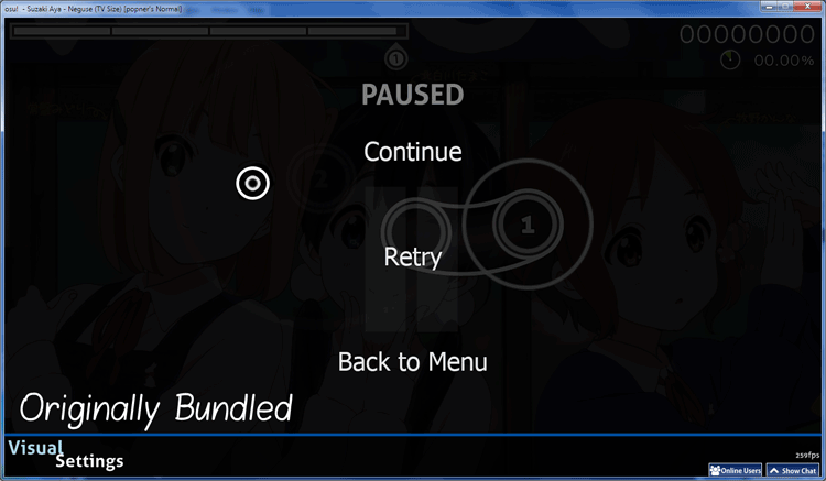
New Set
Gif Comparison
the .ZIP here. For the sake of troubleshooting and being able to revert the image elements in case you prefer the old set, the ZIP includes both the original set and the set I have created. I recommend you storing the folder found in the ZIP within the Extras folder of the Aesthetic skin.
Hope others will enjoy it! And again, this skin is fantastic. Keep up the great work!
I feel this too, only downside of the skin it feels like spinners just come out of nowhere and ive never had that feeling with other skins, theres usually a subtle warning that has me spinning before the spinner shows upReteX wrote: 4p391i
i cant see spinner-approachcircle
can you fix?
It may have something to do with 800x600
Otherwise this is amazing and i've gotten some great results using it! great health bar, circles, and hitsounds, my second favorite skin and thats saying something because i have a lot of skins.
but because of the spinners coming without warning i can only give 9 ducks out of 10
It's been quite a while. I finally got myself to finish the mania skin that I've been working on, and I'm releasing it today along with a few minor changes to the existing skin.
I tried to follow the same style and basic principles I used for the standard skin: A colorful flat theme, as simple as possible while still being pretty to look at.
The skin comes with keys and notes in white and the six colours you may know from standard, which can be combined in any way you like. I hope to create a little online tool as a convenient solution that allows everyone to compile their own color setup in mania without having to mess around with the .ini files, but until then that's the only way. If you need some help, feel free to ask.
The osu! standard skin has been updated for skin version 2.2, but is otherwise mostly the same, aside from a few minor adjustments.
Check the changelog if you're curious.
As always I appreciate any , positive or negative. I haven't been playing mania for all too long, so I'm curious to hear if you find anything that can be improved. Here's a video that shows what the mania skin looks like in 7k.
Link: Aesthetic.osk (v1.3, 5. June 2014)
(Zip archive: Aesthetic_1_3.zip)
File size: 16.9 MB
Status: osu! standard and osu!mania complete
If you've ed the skin already and want to update, make sure you delete the old version first.
Thanks a lot to everyone who contributed ideas or left a friendly comment!
I tried to follow the same style and basic principles I used for the standard skin: A colorful flat theme, as simple as possible while still being pretty to look at.
The skin comes with keys and notes in white and the six colours you may know from standard, which can be combined in any way you like. I hope to create a little online tool as a convenient solution that allows everyone to compile their own color setup in mania without having to mess around with the .ini files, but until then that's the only way. If you need some help, feel free to ask.
The osu! standard skin has been updated for skin version 2.2, but is otherwise mostly the same, aside from a few minor adjustments.
Check the changelog if you're curious.
As always I appreciate any , positive or negative. I haven't been playing mania for all too long, so I'm curious to hear if you find anything that can be improved. Here's a video that shows what the mania skin looks like in 7k.
(Zip archive: Aesthetic_1_3.zip)
File size: 16.9 MB
Status: osu! standard and osu!mania complete
If you've ed the skin already and want to update, make sure you delete the old version first.
Changelog
Version 1.3
- Added mania skin, including keys and notes in 6 different colors and white.
- Various changes to skin version 2.2 and the new beatmap s:
- Adjusted menu-button-background and stars
- Fixed alignment of ranking letters on the new beatmap layout
- Added cursor smoke
- New hitcircleselect in the editor
- Small adjustment to the normal-hitnormal hitsound
- Added the updated menu buttons that should have been there last time
- Added a Target Practice mod icon
- Changed the mania Fade In mod icon
- Slight adjustment of the colour scheme of all hitbursts, mod icons and menu options
- Added a little glow to the approach circle to make it appear smoother
- Adjusted the hitlighting
- Probably more that I forgot about because it's been a while.
- New small ranking icons
- Adjusted shading of default and ring hitcircles from being too bright and flat to a pastel look.
- New color palette
- New font choices to fit the recent osu! redesign: Updated mod icons, hitbursts, score and default numbers and more.
- Changed "Spun Out" mod icon
- Adjusted pause and fail screen
- Added menu snow
- New and improved hitsounds for normal and soft set
- Added alternative big cursor, slight change to default cursor
- Improved followpoints - quicker fade
- Added missing spinner-rpm.png
- Added purple to default combo color palette
Thanks a lot to everyone who contributed ideas or left a friendly comment!
Now! Mostly mania though. The osu! skin is complete as it is and will most likely only see small adjustments in the future.Scalded wrote: 2r29k
When is the next update(( can't wait for more changessssss
Thank you for pointing this out! I'd already replaced the menu buttons with the new font way back, but apparently forgot to copy-paste them into the 1.2.1 release. I made sure I added the right ones this time. (And, yes, that was Tahoma.)RoleyKatsu wrote: 4i512q
One thing I found weird was the inconsistency with the Pause/Fail/Result screen buttons, which seemed to have used a different typeface (Tahoma (or Verdana? Not sure) instead of Aller) for the Continue/Replay/Menu buttons.
This is not supposed to happen, and must be an issue with osu!. I believe this happens when the skin folder already exists? In any case, I've tested it and I can assure you the .osk unzips just fine when the existing Aesthetic folder is deleted or renamed first.Xafnia wrote: 5f2u2c
Osk is improperly zipped.
Osu will unzip it as skins\Aesthetic\Aesthetic
The font used throughout the skin is Aller, the same font used by osu! ever since it abandoned Tahoma (Thank god).nitek1109 wrote: 4q69
This skin is awesome
what font was used to score ?
ReteX wrote: 4p391i
i cant see spinner-approachcircle
can you fix?
I assume you're talking about the spinners as they were when the approach circles were temporarily removed? This should have fixed itself now. Without the approach circle, the spinners were indeed difficult to spot on time. If you think this is still a problem, please let me know.Bassist Vinyl wrote: 6f6df
I feel this too, only downside of the skin it feels like spinners just come out of nowhere and ive never had that feeling with other skins, theres usually a subtle warning that has me spinning before the spinner shows up